|
|
|
|
PANTHEON
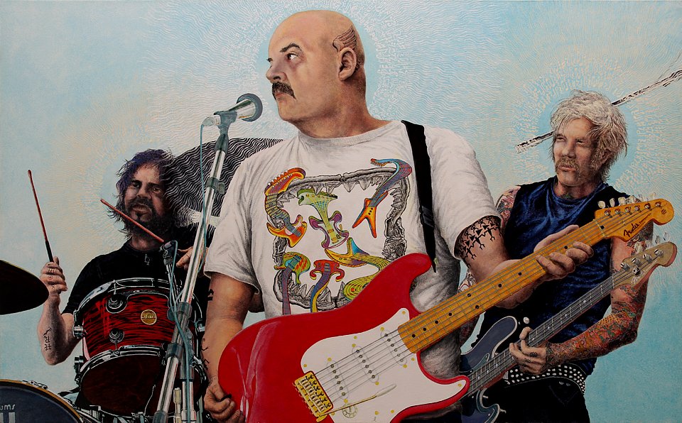
© 2014 Keith Halonen oil on panel 47×29 in / 119×74 cm $ 60,000 US THIS PAINTING IS A GOLDEN RECTANGLE |

|
« CLICK to contact the artist |


|
CLICK » to order this print |

|
|
YOU ARE IN THE PEOPLE PAINTINGS GALLERY
CLICK THE SHORTCUT ICONS ABOVE TO VIEW MORE PAINTINGS |
|
———————————————————————————————————————— |
|
|
— ABOUT MY CREATIVE PROCESS — |
|
|
|
|
|
———————————————————————————— |
| It started in 2010 with a comment on a news show, referring to performers at a Rock and Roll Hall of Fame induction ceremony as a "pantheon of rock gods." I'd heard this phrase before in a similar context and remembered the word pantheon from high school Latin class. Yet I couldn't remember exactly what it meant, so I looked it up... |
|
pan·the·on n. 1. Pantheon. A circular temple in Rome, completed in 27 BCE and dedicated to all the gods. 2. A temple dedicated to all gods. 3. All the gods of a people. 4. A public building commemorating and dedicated to the heroes and heroines of a nation. 5. A group of persons most highly regarded for contributions to a field or an endeavor. |
|
The news commentator was citing this last definition but global media has recreated the hero concept. Even movie stars are now worshipped as heroes by impressionable types apparently incapable of psychologically separating fiction characters from the actors who portray them. This malady seems to afflict all ages but most particularly the young.
Thinking on this brought back memories from my own youth, when I entertained naďve aspirations to be a rock musician. Turns out that's a prerequisite. My mother had 9 brothers and sisters and my father had 17! Among my 50 aunts and uncles and cousins galore, there were four or five bands working in bars and dance halls. Even if a day job interfered with a weekend gig, one or another of the family musicians would be available to stand in. But I wasn't allowed to take guitar lessons, I bought a cheapo guitar with cheese slicer strings and all the charm of an axe, as they were often called. Perhaps because I never did play well with others, I was self taught. Later I got a very fine guitar but soon abandoned dreams of a musical career to focus on art, far more compatible with my behind-the-scenes loner disposition. Such were my thoughts as the idea of Pantheon began to take shape. I was going to need models and props and image resources. Models don't come cheap, and I needed a full band. I needed some real musicians... |
|
|
|
|
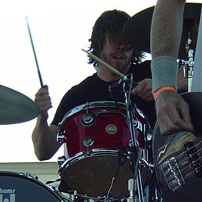
The drummer and bass guitarist from Juliette Lewis' band Juliette and The Licks 9th Annual Oyster Fest 17 May 2008 Great Meadow, Fort Mason, San Francisco |
|
Fortunately, I found some useful photographs taken a couple years earlier. I keep extensive archives of images that may one day come in handy when I'm composing a painting layout. Wow! Real musicians! Now all I need is a lead guitarist to round out my pantheon of power players... shades of Cream! Come to think of it, I'll even need the guitar! |
|
|
|
|
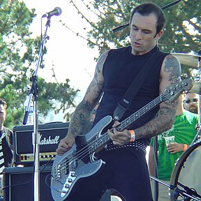
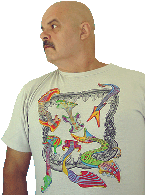
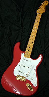
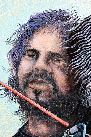
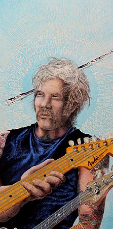
Yeah, that guy'll do! After all, most rock and roll gods are getting a little long in the tooth. Now, can I get a Strat from a Fender website? OK! Good to GO! |
|
|
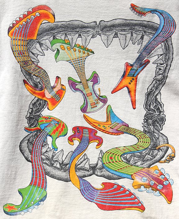
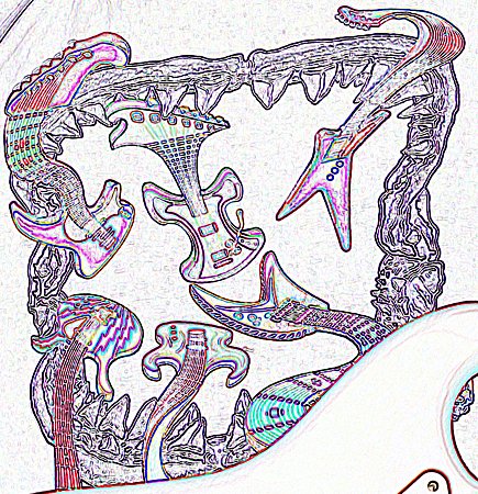
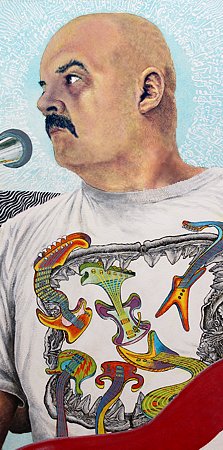
And there's that great tee shirt I did for Al Hartman way back when... Eel-lectric guitars swimming out of Megalodon jaws! Now we're talkin'! |
|
Aspiring artists, beware! Someday I will teach a course called Creating More Work for Yourself 101. My first class will be appropriately entitled Why Not Paint Something in Oil You Already Drew in Ink? To create this artwork, I first hand drew a half-dozen registered fine-line black ink color separations (one for each final silkscreen ink color) on tracing vellum overlays that combine to produce the resulting tee shirt print you see above. Kids, don't try this at home! It's only for the brave of heart! Now, of course, I had to reconstruct my design in oil paints – a suitably masochistic first object-lesson for my forthcoming course!
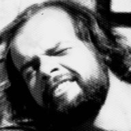
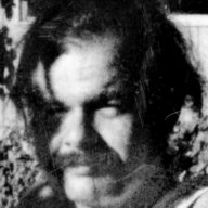
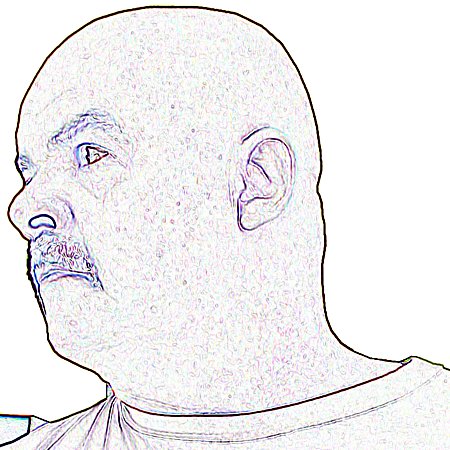
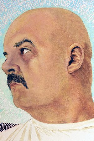
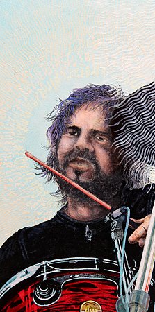
Still I had the problem of what to do about those real musician's faces. Without model contracts I needed to make them over into "somebody elses" who wouldn't object to having their visages conscripted for some unknown artist's personal amusement. I know! WWMPD? What would Maxfield Parrish do? Got it! Surely he would pose for himself! And who more appropriate to serve in the vicarious fulfillment of a failed dream than the disabused dreamer? I would be the whole trio! |
|
|
|
|
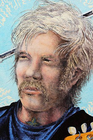
Voilŕ! Drummer Keith 1974 and bass guitarist Keith 1975 to complement lead guitarist Keith 2006 |
|
During the entirety of production from the innocent moment of inspiration through the egocentrically corrupt painting process to this very web page, I generated 167 digital image files and 3 text files containing spec and production notes. For any major endeavor, I create a folder named for the project – in this case PANTHEON. In every project folder are several subfolders: AFILE houses alpha resource bitmap images and vector graphics files. FILEWORK contains the same files resampled, resized, and otherwise tweaked, and then saved in lossless editable formats. NETFILES holds those materials converted to lossy non-editable Internet image file formats. These are the images you see here. PRINT contains vector and bitmap files to be printed out either as handheld painting reference images or for other specific purposes. This is my organizational praxis and it serves me well.
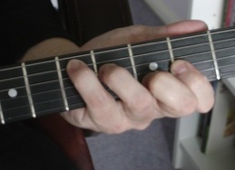
Without going into lurid detail about every particular image covered by the previous paragraph, I'll just say my production process had arrived at that juncture where I had to prepare imagery for transfer to my already prepped painting panel. I fired up my computer and culled together the basic images required for my intended layout – band member photos, red guitar, mike stand, pick, fretboard hand position from an instructional guitar playing site (Hey! It was hella easier than looking at my own hand in the mirror while simultaneously painting and playing left-handed a guitar I don't even have), etc.... |
|
|
Then, in my several graphics programs, I conformed the differently-sized images to a common scale – enlarging, reducing, distorting, rotating and so on. Being a PC user, I prefer CorelDraw and Corel PhotoPaint to their Adobe equivalents. Once everything was merged into a single cohesive image, I attended to last minute improvisations, such as reinventing my arms to cradle that Strat. Next I produced one large printed image to hold in my hand as a detail guide while painting and one 5-inch wide image to lay on the bed of my opaque projector. Then I drew the blinds, projected the image, and lightly sketched the outlines on my painting panel with an ordinary pencil. |
|
|
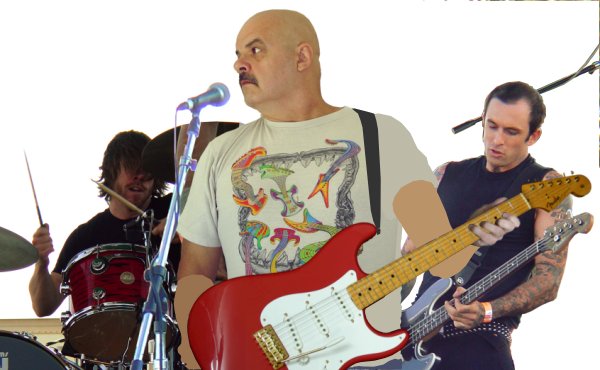
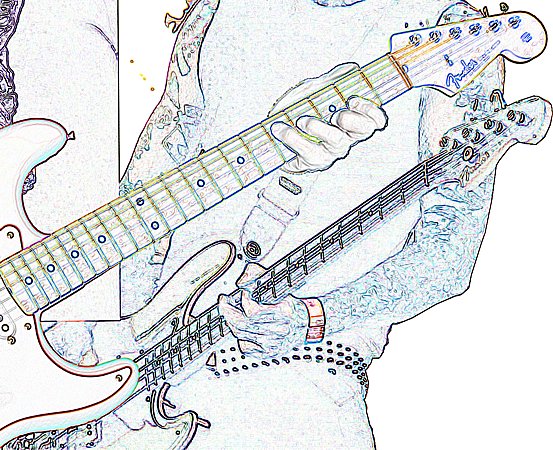
COMPOSITION LAYOUT layered foreground to background: microphone stand, frethand position, Fender Stratocaster, fake guitar strap, fake arms, lead guitarist me 2006, drummer and bass player |
|
To accurately detail these instruments, I used my computer graphics program's edge detection tool to isolate outlines and print out hard copies scaled to the exact size of the preliminary pencil sketch on my paint panel. I'll describe how this process works for all the various elements. I began by measuring the distance (to one one-hundreth of an inch – 0.01") between any two clearly identifiable points at either extreme of the already projected and sketched pencil outlines on my paint panel.
Then I subjected a high-resolution scan of my composition layout photo (above) to the CG edge detection tool and added a straight line between the same two points on the resulting bitmap image. Next I resampled that outline bitmap to the exact scale that made the line length equal to the actual physical distance between the two points on my painting panel. From this final actual-size 1:1 outline bitmap, I cropped individual areas and printed out sections of those on regular or legal-size stationery. I taped those sheets together where needed and used them to work on one portion of the trace and transfer process at a time. |
|
|
|
|
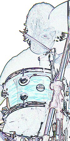
drum edges ⇐ ⇒ strat edges |
|
Variously sized handheld color image printouts would guide me while I was actually painting. The truly artsy part of my overall task was to produce light and shadow continuity to visually connect all the disparate image elements throughout the scene. This even included reflective color elements apropos "chromed" surfaces. Those treatments, however, were still in the future at this point. My immediate concern was having a relatively accurate prelim sketch on my gesso-coated paint panel. I cropped the same final CG edge detection bitmap to print outline details for the tee shirt imagery as well as general facial details... |
|
|
|
|
tee shirt edges ⇐ ⇒ face edges |
|
The next step with these edge printouts was to tape them ink side against my studio windows (or ink side down on a light table). I used a regular #2 office pencil (dulled to yield a wide line) and traced the basic outlines of all important image elements on the backsides of the sheets. Next I positioned the sheets with low-tack artist's tape onto my paint panel – ink side facing me and used a dull stylus to retrace the outlines. The stylus pressure transfers the underside pencil graphite faintly onto my paint panel. I then did the same for details on the new faces of my sidemen, carefully selected from past photos of myself to conform to the positions of the bodies to which they were to be fitted. Thus we arrive at the three Keiths who populate my imaginary cosmic rock band... |
|
|
|
||
|
Now let's skip past all sorts of whining and snivelling about how tedious the painting process can be. That's why there's a TV in my studio. It furnishes entertainment for my brain while I'm performing no-brainer art tasks (which most are). Let's jump straight to the next really exciting inspirational moment. Sometimes, especially when I'm dealing with dynamic drama-rich imagery, I get an idea that further enhances my original intent. This brings us to the next lesson in my future course Creating More Work for Yourself 101. Stooge Curly Howard used to say, "I'm thinkin', I'm thinkin'! But nuthin's happenin'!" Well, I wasn't so lucky. Something happened while I was thinking and thinking, and then I compounded the problem by acting on it! This class session might be entitled Succumbing to Excess Inspiration. Mulling over the notion of a plurality of gods, a bulb suddenly lit up above my head. Or, more appropriately, a halo! Yes, why not? Why not give each of my rock gods that symbolic aura of holier-than-thouness, a halo?! Of course! It only makes sense! |
|
|
|
|
drum halo ⇐ lead halo ⇑ ⇓ bass halo |
|
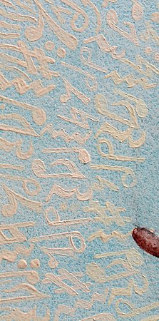
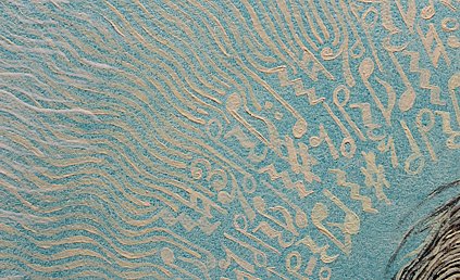
It just seemed mean and small to give such noble divinities plain ordinary orthodox haloes. That just wouldn't do! Ask me how it is that this painting took 51 months to finish. Or how it can be that I didn't just pull a "Duchamp" and completely give up art for 20 years to immerse myself in chess! It could have easily played out that way! It could have! Yeah, that's right. Class number three in my Creating More Work for Yourself 101 course will dwell interminably on the topic of How to NEVER Leave Well Enough Alone!
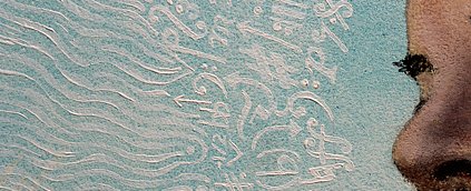
In an all-too-characteristic fit of exponential lunacy, I decided to depict the haloes as cloudy concentric circles of sheet music symbols! Yup yup yup! Adding to my digital files and a physical manila folder filled with tracing print-outs, I now developed a thick file folder of sheet music and printed out some downloaded glossaries of sheet music symbols. So now my saintly minstrels are radiant with key signatures, time signatures, notes, rests, repeats, bars, ties, augment dots, clefs, accidentals, bows, dynamic marks, ornaments, accents, sharps, flats, naturals, trills, glissandos, tremolos, mordents, harmonics, fermatas, mutes, fingering numbers, whole notes, half notes, quarter notes, eighth notes, quarter triplets, eighth triplets, sixteenth triplets, etc. Even dad's banjo sheet music came in handy for this brainstorm! |
|
|
|
||
|
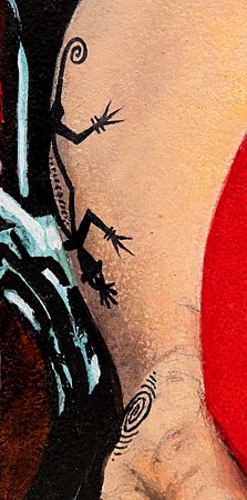
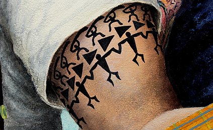
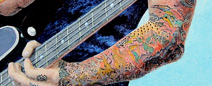
You may have noticed the odd juxtaposition of the boom mike that looks like a spear going through the bass player's head. "Why," ask fellow artists, "would you not edit that out? It's confusing and not very artistic-looking." Precisely the point. Art is too often idealized and sanitized. It's deliberate in many cases, I suppose, because it's what's taught as the conventional modality. Reality, however, is exempt from vain idealism. It routinely disobeys the admonition to "polish that turd." But I strongly suspect that just as many artists lean on this venerable convention as justification for being habitually lackadaisical. To see curtains and bookshelves painted as realistically as possible, take a gander at SQUARE ONE. Scroll down the page to check out some of the close-ups. Most real household bookshelves do not resemble an attorney's legal library. Maybe the issue with painting realistic curtain patterns is that artists have to paint the repetitive pattern over and over and over. The graphic artist only had to draw the basic curtain motif once, designing it to be nested into itself time and again across the entire expanse of the fabric. Hooray for the graphic artist. Boo-hoo for the lazy fine artist. So the short of it is, I chose to pledge my skills in homage to reality. If reality spears a boom mike arm through a bass player's head, so be it. I approve. Looking at what's evolved on my paint panel up to this point and ruminating on life's liberal embrace of its kissing cousin, reality, it suddenly dawns on me that something's missing from two of my band members. The bass player is real enough with his goth dark apparel and his cutting-edge tattoo sleeves. But suddenly I found myself plunging into the fourth class session of my ongoing course Creating More Work for Yourself 101. This one's an extension session to my third class with a derivative title... Hey! You missed a spot! What self-respecting rock and roll star has no tattoos? Many in that elite echelon have even graduated to piercings and yet my drummer and my lead guitarist were tattooless! Rockers fare best when they exude an authentic mystical charisma. So again I went into a deep think (Damn you, Curly!) and again something happened. I had yet another inspirational epiphany. Drugs and magic, yes! Tattoos about drugs and magic. Perfect! Right up Rock'n'Roll Alley, yes sir! Drugs and magic! |
|
|
|
|
tribal lizard, kundalini ⇐ tribal warriors, arrowheads, dancers ⇑ ⇓ magic glam sleeve |
|
Alrighty now! Tribal tattoos are all about magic, right? And those colorful contempo glam tats are loaded with stars and tigers and playing cards and what-not. Magycke, indeed! |
|
|
|
||
|
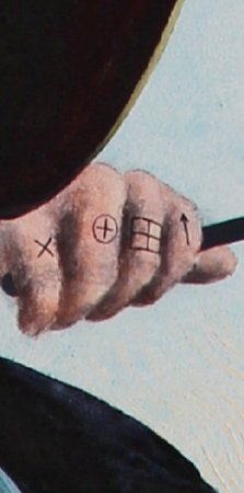
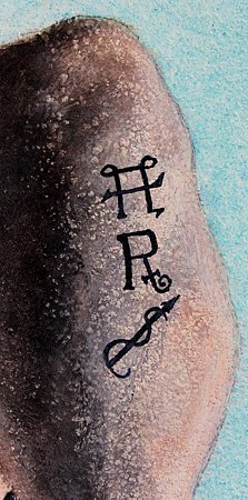
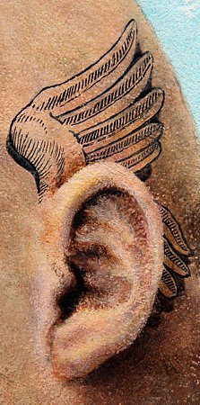
⇐ rotated 90° clockwise CHESS ANNOTATION SYMBOLS L–R: captures or weak point / time / center / with initiative ⇒⇐ rotated 180° for correct orientation ALCHEMY SYMBOLS T–B: mix thoroughly / grab or take / purify ⇒the helmet wings of Hermes Trismegistus (Greek) aka Mercury (Roman) aka Quicksilver |
|
Art forum accusations aside, I adamantly aver that I am not a perfectionist. By its very nature it is – as attributes go – an unattainable ideal. Any critical eye that examines my work closely, or views close-up images excerpted from it, will find no evidence of perfection. However, I am willing to admit that what I am in fact is an excellist. That is one who understands that excellence, a 95% imitation at best, is perfection's mortally achievable equivalent. If my skies are blue, my grasses green, and my flesh tones within acceptable ranges, I am content. If I leave less to the imagination than many artists and spend profuse verbage when writing or speaking about my imagery, I see no obligation to apologize for so doing. There is no rule. This is my way.
As mentioned elsewhere on this site, I have even been criticized for signing my name to my work! I lost my ego every time I got high back in my psychedelic acid days, but every time I came down there it was again! Spare me, please! Are we not entitled in our inconsequential little lives to pat ourselves on the backs for this or that job well done? But I do hold the art to be of broader significance than the artist, and my concession to this conviction is that in most cases I will camouflage my signature within the graphical structure of my painting. It is my logo to do with as I will, and I choose to subdue it to the art it proclaims as its own. Now for a tip of my hat to the graphic design and illustration occupations, where I served others for three decades. I got meager recompense for my efforts there but came away with disciplines that complement and enhance my lifelong fine art vocation. Conversely, I definitely brought more from my fine art experience to my design and illustration career than I got out of it in return. Still, the importance of the proliferation of logos and identity symbols in our modern world cannot be overestimated; hence, the following images... |
|
|
|
|
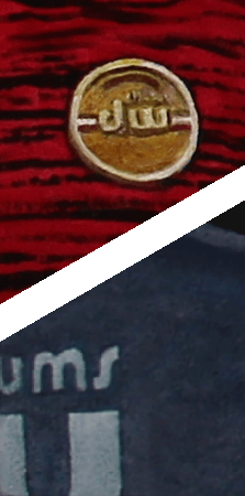
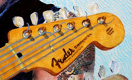
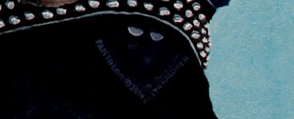
drum logos ⇐ fender logo ⇑ ⇓ title, copyright symbol, date, artist's signature |
|
This concludes my special presentation PANTHEON: Anatomy of a Painting. It's been a long and winding road, with more twists and turns than I could possibly have anticipated incorporating into my future Creating More Work for Yourself 101 course. If you're reading this, I thank you for your exceptional patience and rhino-hide tolerance in forging the full distance. You must be glad you're "done, done, the long race run," but please reserve some sympathetic joy and relish your well-earned relief for the knowledge that it took me 51 months longer than it took you to slog through the reality of this production.
Did I work every waking hour throughout? No way! Did I put in at least 20 hours a week? You must be joking! So during the majority of the real-time waking hours twixt start and finish, how exactly did I squander my precious time? Let's see, I read a bunch of books and studied a lot of chess. I watched countless TV programs. I calculate I've eaten around 1,550 sandwiches, drunk around 600 gallons of coffee, and slept just over 450 days. Then there's this website, which consumed about 14 whole days during the interim. Fortunately, this is because I update it only on the solstices and equinoxes. To put it into perspective (one of an artist's favorite things), I only spent some 9 days each urinating and showering, occasionally at the same time. Drought conditions, you see. As we part company until whenever, I will save you a scrolling climb back to the top for one last look at the finished work of art. Bye-bye for now and do enjoy PANTHEON... |
|
|

|
|
———————— GALLERIES ———————— 


|