|
|
|
|
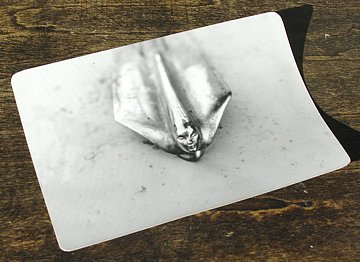
1 - ORIGINAL
PHOTOGRAPH |
|
3 - FIRST
PAINT LAYER |
|
| ———————————————————— |
|
So far, my composition has only the exquisite hood mascot, not really enough to satisfy. I Googled "cadillac hood ornament" to locate pertinent resource materials. Hard copies make handy visual working references. |

|
|
I scan at the highest practical resolution because the one-way corollary is that only downsampling is reliable. I burn this to CDR and immediately save a b-version as my primary working file. I cropped the strip off the bottom to leave the main image in the same golden rectangle configuration as the panel. A simple constant is multiplied by the unchanging horizontal dimension to calculate the vertical. I admire the direct geometry linking the dimensions of this special rectangle and the way it can be repeated in successively smaller sections by fractally spiraling the formula inward. Many of my paintings are Golden Rectangles. I need two sizes of final layout. The first must be 1:1 to the original photo so that I can register its projected image with the prelim outlines and sketch in the new element outlines. I also need a larger reference image when painting. All layout work will be done in my favorite photo program. Cameras and computers — the old masters would be envious. I am merely in awe. |
| ———————————————————— |
|
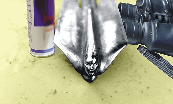
1. Cadillac photos downloaded from the Net give a semblance of the original finish color. It was already 27 years weathered when I shot it and my original photo was grayscale. 2. Caddy hood mascots culled from Net searching include another angle of the same ornament. In conjunction with the auto photos these yield some derivative size specs by comparing them to known dimensions such as tire size. In its era, this winged velocity goddess represented speed, acceleration, travel. My new elements must reinforce this and merge into my modern thematic direction. What else might be on the Caddy hood to support the strong dynamic implicit in the ornament image? 3. A modern energy drink, high-caffeine and ultra-sweetened, seems plausible and its intended purpose parallels the hood mascot's significance in its own way. I shot a dozen quick vantagepoint views, each time slightly adjusting the camera's orientation to capture a variety of approximately correct images. Digital photography lends itself readily to such demands. The best candidate pose in the bunch suggests itself. Once the decision was made, I traced an outline-mask, copied it and, with a bit of resizing and rotation, I finally positioned and pasted the prop element into the main scene. In this case I even had to mask and cut the mascot itself from the main scene so that I could position the newly added elements behind or beneath the mascot wings. I didn't change its position. I merely brought it "forward" to the topmost layer. 4. The antler was a brief flirtation with a contrasting element. I did everything to it that I did for the energy drink but thoroughly disliked it and no amount of fiddling assuaged my discomfort. After spending half a day on this detour, I abandoned it in favor of strict compliance with my mission statement. |

|
|
5. Binoculars! We keep several pair handy for local wildlife. This prop jumped out at me as I scoured the house (and my brain) for appropriate candidate image elements. I took over 20 photos of the binoculars to be sure that I had at least one reasonably accurate pose to integrate into my scene. The implications are solidly in alignment with my declared theme and the other two primary elements. Many associated concepts are now in play: fuel, energy, power, force, speed, travel, direction, distance, and time.
|

|
|
6. The Final Layout emerges from the computer. I added a pale yellow tint to the Caddy hood background field. The new elements are positioned in visual agreement with the hood contours and they appear where anyone might casually put them down. This scene is possible. even likely. It's easy to concoct reasonable scenarios that might produce this scene. Time is a vehicle. 7. and 8. Reflections are images culled from multiple positioning shots. These are intended to reveal what the hood mascot reflection might look like on the buffed aluminum can surface and what the can and binoculars reflections might look like on the wing ridges of the ornament. Since I don't actually have the mascot, I used a chromed big rig horn to emulate the reflective properties of the mascot wings. These props were repeatedly repositioned and reshot to yield enough poses to guarantee passable matches. There is no perfection here; close is close enough. 9. Rusty chrome photos portray typical household objects that happen to have rusty pockmarks pitting their chromed surfaces, all posed to reflect sky, and 10. Rusty weathered white-painted metal, various surfaces on an old planter stand. These last two sheets furnish sufficient visual information about rust on which to base my color interpretation of the old 1977 grayscale photo. |
| ———————————————————— |
|
Now the same-size-as-original final composition layout goes into the opaque projector, where I register the revised layout to the panel cartoon and sketch in the major outline features of the additional prop images.
It's time to paint The First Layer! |
| ———————————————————— |
|
|
1 - ORIGINAL
PHOTOGRAPH |
|
3 - FIRST
PAINT LAYER |
|
———————— GALLERIES ————————


|