|
|
|
|
3 - FIRST
PAINT LAYER |
|
5 - HIGHLIGHT
AND SHADOW |
|
| ———————————————————— |
|
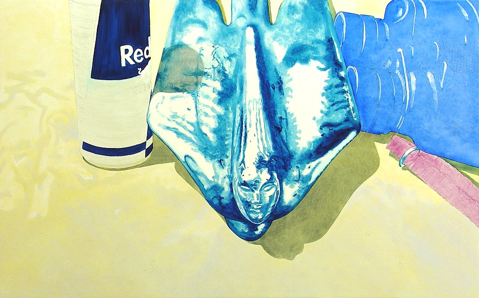
FAT OVER LEAN is the oil painter's motto. Each layer of paint must contain more oil content than the layer underneath. There are a couple ways to achieve this. One can maintain separate medium mixes that contain known percentages of oil and then use a progressively oilier one on each successive layer. Or one can simply mix sparing amounts of a preferred medium into the colors and apply them in a manner that ensures the thinnest possible layers. Having done it both ways, I endorse the latter method. Less medium with fewer ingredients means reduced cost up front, less waste during production, and fewer opportunities for something to go wrong. The danger in disobeying the fat-over-lean admonition is that a less-oily upper layer may completely dry before the oilier underlayer. As the underlayer slowly dries, it will cause the already brittle top layer to buckle, crack, and wrinkle into a texture known as "orange peel" because of its resemblance to that surface. The layers I apply are so wafer-thin that this becomes a negligible concern. My second layer starts moving away from the foundation tones toward both lighter highlights and darker shadow. I have already decided that I won't use black in this painting. Payne's Gray will create layered shadow effects where they are needed. This blue-blackish shade will contrast well against the hood color but still allow some of it to show through. As the yellow climbs to paler highlights and the shadow deepens, I anticipate a pronounced vibrance similar to the eye's interpretation of deep shadow surrounded by intense color. After all, that is the idea. |
|
|
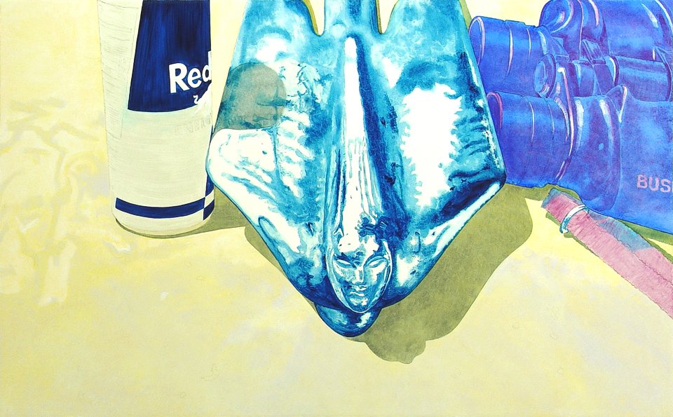
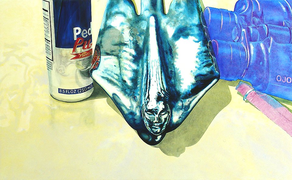
A sharp-edged Payne's Gray shadow layer is applied to the hood and where the can would cast shade on the wing of the mascot. The hood shadows will be deepened in future layers but clearly distinguish the shade area from the lit area. The effect is intended to emulate brilliant midday sun. It should be noted that the shadow areas are the artist's best guesstimate. The shadows are my paramount unification tool, tying together the disparate elements that never actually shared a common light source. When it's possible to compose an element prelim photo with a relatively accurate shadow, I will attempt it. Otherwise, I will fake it! Art! Even as early as this second layer, some semi-opaque work is in order. Here see the pale softening of the Jaune by a film of warm Flake White mixed here and there with a smidgen of Payne's Gray. This frosty film on top of the original underpainting increases its chroma and helps to suggest the shape of the hood, lighter topside and a bit darker where it curves downward toward the viewer. The hood now has two levels of reflectivity as light bounces back at the viewer from the gesso undercoat below the yellow foundation layer and also off the Flake White tint layer on top. |
|
|
While damp areas dry to tack I work the adjacent zones. Here I have blended graduated-tone patches of Cobalt Violet into the Ultramarine binoculars. This reinforces the illusion of form and further establishes detail. The logo on the binocs was achieved by lightly dampening a brush with thinner and then scrubbing into the two-day-old Ultramarine layer to remove some pigment before applying the thin Violet hues. I also applied some Thalo over the Violet where deep shadow is later intended on the strap. At this juncture I had some trepidation about the logos. When I intentionally depict name brands, I contact the trademark holders for advance permission. In this case, my concern is that the brand familiarity may distract viewers from my already subtle gist. It's not imperative that viewers see through my work to the gears turning inside my head but I do not want to send them off in irrelevant directions. I decided to create my own power drink logo (done it a thousand times in three decades) and to invent a new logo for the binoculars as well. |
|
|
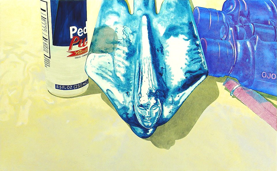
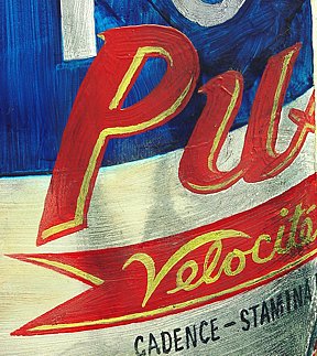
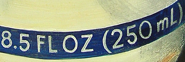
And thus was born Pedal Pusher, an energy drink for bicyclists! And also Ojo binoculars, presumably from the lands South of our borders. They're extensions of your eyes, as McLuhan would point out. I did counter my original decision to eschew black by adding just a touch of it to Payne's Gray for the ingredients text painting. Brush-painting rigid typographic characters is daunting and it's fortunate that the results need not be crisply realistic. A close look at the text and logo work on the can is an eye-opener. There is nothing about it that approaches perfection. What makes it work at all is adherence to the perspective arcs of the typography guidelines. The overall effect is acceptable realism. |
   |
|
Alizarin Crimson with a cool Titanium White tint makes a stand-out red logo accented in Winsor Yellow, also tinted with Tit. I preferred the warmer Flake White when working on the hood, which is supposed to be bathed in golden sunlight, but the can logo colors can use the added brilliance of the Titanium pigment, especially since both colors must cover darker undercoats. A bit of the Jaune and Winsor Yellow are lightly smeared into the Iridescent White can color to symbolize reflection of some of the hood color. Payne's Gray is daubed on to the can to represent shadow. By this point in the process my fingers and palms are constantly smudging nearby patches of damp paint and I'm repairing them just as quickly afterward. It's unavoidable and in anticipation of it I always keep a bit of the previous layer's colors knotted in swatches of Saran Wrap. Even if I didn't keep a repair color, I am usually able to remix a small sample in the same proportions for patchwork. Layering is a forgiving process, affording the painter much flexibility in paint application and removal. Fixing blunders is usually an easy task even if it is vexing work. |
|
|
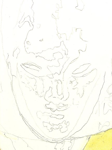
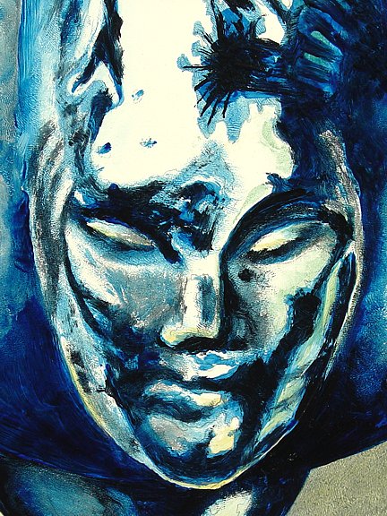
I turn now to the mascot detail and deepen the shimmering chrome reflection effects by adding both Prussian Blue and Payne's Gray. With the label colors still on my palette, I clipped the reflection reference sheets to my easel so that my hands were free to paint the can and binocular reflections onto the mascot wings. I later had to repaint a Payne's Gray layer over the section of the mascot's wing where the logo reflection crosses into the can's shadow. I also worked some on the reflection of the mascot in the aluminum can. Reflections are all unique to a given vantagepoint. In paintings, they must all return their reflected distortions directly toward the viewer's eye. A smudgy representation of the can's much muted reflection in the weathered hood is daubed on in Payne's Gray and I also use it to create the irregularities in the can's surface. The fragile aluminum can shell was slightly dented from an on purpose squeeze. After completing the work I was not satisfied that the effect properly conveyed the dent but I declined to worry the area on the grounds that this detail is not integral to the theme. Reflections are less demanding than rigidly structured objects. It's important to me to portray them with at least token accuracy because I do not want anything to register with viewers as subliminally flawed. But no one will be giving a reflection spot quiz, so there's no burning demand for ultra-fidelity. In fact, the only way that I might accurately portray the reflection of my logo would be to reproduce it flat on adhesive label stock, tape it to the can, and then reshoot some reference photos with the chromed big rig horn. Too much trouble, really, since I can just fake it to my satisfaction by looking at what happens to the real soft drink logo reflected in the chrome horn. |
  |
|
The Payne's Gray is painted more thickly now onto the under edges of the mascot and used judiciously in the face and wing areas. Where the dark paint areas are not bound by a well-defined outline, the pigment is blended into the surroundings by the fingertip patting method described earlier. A hint of Jaune simulates reflection from the hood onto the downward-facing portions of the sculpted face. |
| ———————————————————— |
|
The painting tells me what to do next. As I appraise it from across the room, I see that I've "worn out my welcome" in Layer Two, now that every section of it has been treated to a secondary coat of glaze.
The most orderly layering work is past as I now start to snipe here and there at whatever area most needily begs me for attention. My palette will get cluttered now with daubs of previously used colors and with some new complementary tones to further support the growing reality of my final image. Let's see what happens in the third and future layers as I rise higher and dive deeper into Highlight and Shadow. |
| ———————————————————— |
|
|
3 - FIRST
PAINT LAYER |
|
5 - HIGHLIGHT
AND SHADOW |
|
———————— GALLERIES ————————


|