|
|
|
|
2 - SOURCE
MATERIALS |
|
4 - SECOND
PAINT LAYER |
|
| ———————————————————— |
|
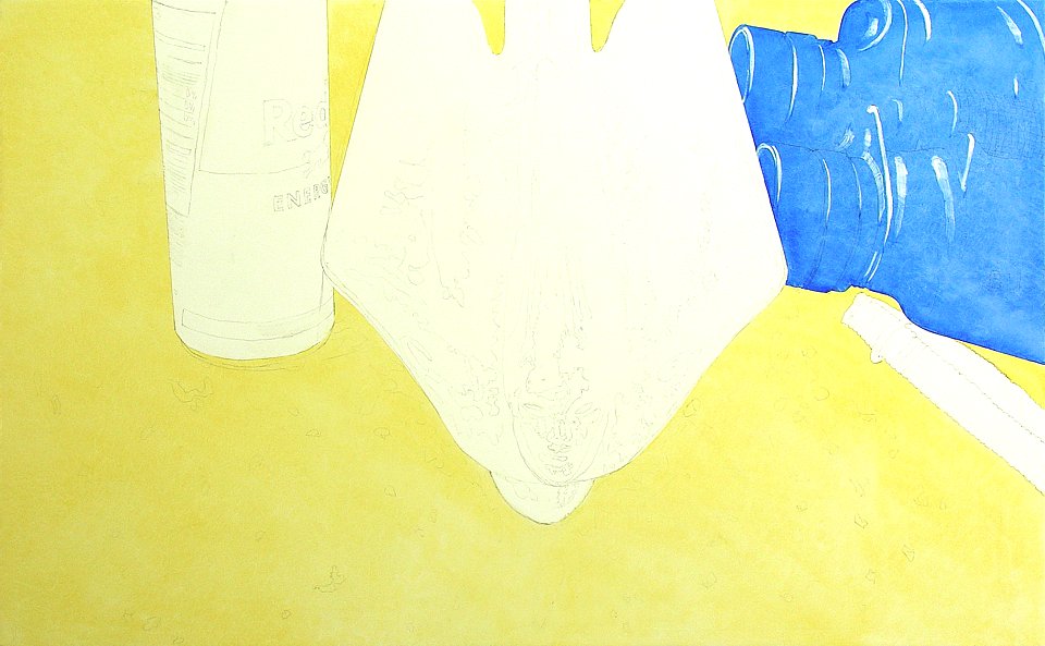
I alternately squint and then stare at the final layout and the Cadillac car references from the Net. Nothing is critical but I need an impression of the overall field color that will dominate. My initial glaze layer establishes the foundation tone of each major layout element. I blend some Studio Products Maroger Medium into Jaune Brilliant for my field glaze. This is only the second painting I have done using this well-established painting medium but the first (Taking Care of Business) demonstrated its value. I occasionally thin it sparingly with their Spike Oil of Lavendar or thicken it with their aromatic Oil of Clove. I selectively remove excess paint using a brush dampened with d-Limonene citrus extract from Florida Chemical. Most of my brushes will be sable or soft synthetic. As usual, I'll be finger-painting more than brush-slinging. I'm a layerist. I'll be applying successive wafer-thin transparent glazes of color pigment suspended in medium. Ambient light from the environment passes through the cellophane-like glaze layers to bounce off the brilliant white undercoat and then travel back outward again through those same layers before entering the viewer's eyes. This method more accurately emulates natural light reflection and refraction behaviors in the atmosphere. It imbues originals with a deep radiance that translates inadequately on the Net but does benefit print media, to which it is similar in nature. I prefer this layered approach to merely having light reflect directly off the surface of opaque color applied straight from the tube. |
|
|
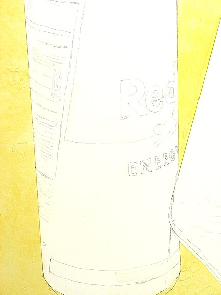
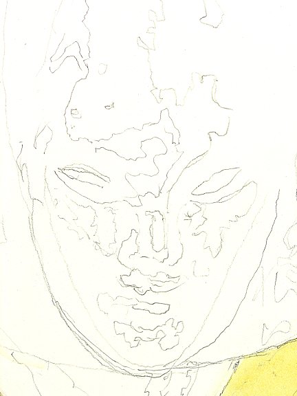
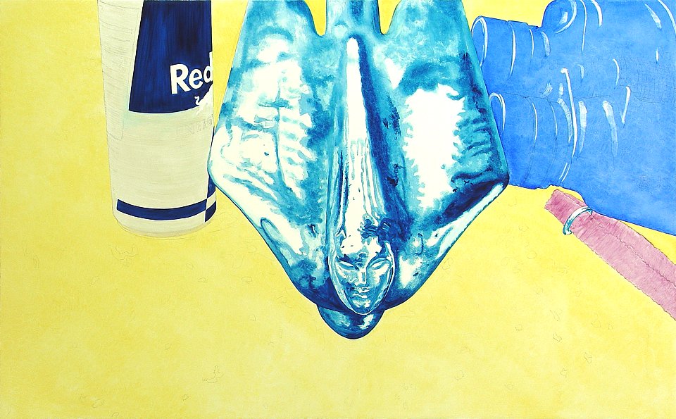
Here are the first layers of glaze, Jaune Brilliant in the hood field and much-thinned Ultramarine Blue Deep for the binocs. The prelim cartoon is evident in the unpainted areas and pencil even peeks through the glaze. At this stage corporate logos are visible but a later rethink persuaded me to recreate these brands as fictional archetypes. I don't mind depicting bonafide logos but felt that here they might distract. The Cadillac hood mascot, on the other hand, is a dignified and strong symbol that sports no logo per se and handily earns its dominant position. Many younger people may not even recognize the once revered status symbol. |
|
|
Before applying a second layer anywhere on my panel, all major image elements will have at least one original glaze layer. The only areas exempted are those intended to remain brilliant white, just as in watercolor. Each color applied in this first layer represents the foundation hue of the major image element over which it has been applied. Future layers will move away from these mid-tones toward highlight and shadow. Successive color layers will also alter the foundation color. |
|
|
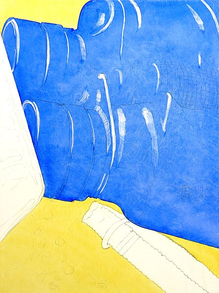
Note the highlight strokes in the binoculars. Here I used a brush barely dampened with thinner to remove some of the Ultramarine soon after it was applied. This technique involves lots of turp-dipping and rag-wiping of the brush, but it can be vague or precise as the situation demands. I employ this drop-out paint removal technique extensively. Here it begins to define detail in complex areas. Also, it's expedient to apply glaze with some cavalier "slop" that doesn't fret about "going outside the lines". This paint-removal technique is especially useful in shaving the outside perimeter of a glazed area obediently back to a very definite demarcation line. It's understood beforehand that foundation colors are vividly saturated out of necessity, since they will be gradually covered by future color layers that subdue their brilliance. My main motive for layering is to produce depthful color luminosity where it more accurately suggests reality conditions. The direct and literal way to achieve that is by applying the most achromatic reflective color first, at the deepest level of all. Hence the brilliant white gesso undercoat that will impartially reflect light without spectral color separation. Then the glazer's task becomes a sensitive exercise in artistically creating nearly-transparent layers of color above that. It's a labor-intensive endeavor as the sparingly applied paint pigment is spread so thinly that it behaves like a stained cellophane filter that will both refract and impart color to light passing through it in both directions. When the painting is finished, most of the light that makes it visible to the eye will still be bouncing off that deepest white undercoat. Only the highest surface highlights and a few flat colors will be reflecting ambient light intercepted before it can penetrate more deeply. How's that for depthful? The overall effect is most keenly appreciated by looking directly at the original painting in a well-lit setting, a pleasure not widely available. A fine print would be next in order of desirability! As the first layering phase continues, I've selected Iridescent White to simulate the brushed spun aluminum can. This tube color behaves in reflectiveness and texture very much like the metal it represents. I applied Prussian Blue for the can's packaging field color, and Cobalt Violet for the binoculars strap. The hood mascot is Thalo Blue with Prussian Blue shade to simulate sky color variegations reflected in chrome. |
|
|
A relatively even distribution of paint pigment is achieved by brushing on the glaze mixture as thinly as possible and then tapping at the surface with one's fingertips to spread and blend. Many pigments are toxic and prophylactic studio hygiene dictates frequent washing with oil-cutting dish detergent. I wash my hands at least hourly, sometimes more often. This fingertip method is very effective in depicting subtleties of object surface coloration. When a color seems too saturated, dry fingertips can be pressed against the surface to remove diminutive traces of pigment. Slowly working over an area with this type of paint-removal technique gradually reduces the amount of pigment covering the area and gives the artist delicate control. Coarse-weave materials and even textured objects can be pressed against fresh layers to selectively create "reverse" patterns and textures by removing paint. This affords the artist opportunities to mix color "on the fly" by finely adjusting coverage of a fresh topside layer over one or more sub-layers. It's work but it has its rewards. These paint-removal techniques are employed only after a previous layer has dried to tack. That takes 36 to 48 hours, depending on temperature and humidity. Then another layer can be applied and safely reworked using paint-removal techniques without fearing that the thinner might penetrate too deeply. |
| ———————————————————— |
| With a single glaze layer covering all surface areas except those intended to remain bare, I now move on to The Second Layer. |
| ———————————————————— |
|
|
2 - SOURCE
MATERIALS |
|
4 - SECOND
PAINT LAYER |
|
———————— GALLERIES ————————


|